A fresh rebrand, modern materials, and award-winning annual reports
Working together since 2017
After rebranding, D155 received the highest NSPRA distinction nationally
Numerous NSPRA Publications and Digital Media Excellence Awards
New logo & branding goals
modern, clean look
keep red as a dominant color
incorporate new taglines
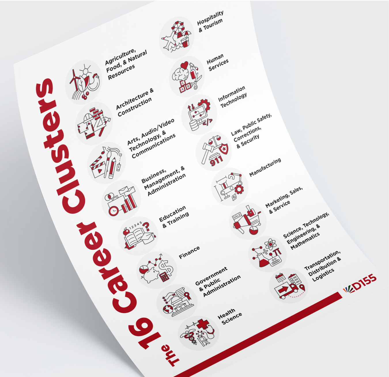
incorporate all 5 high schools
visuals of promise and new horizons
How we delivered (and continue to)
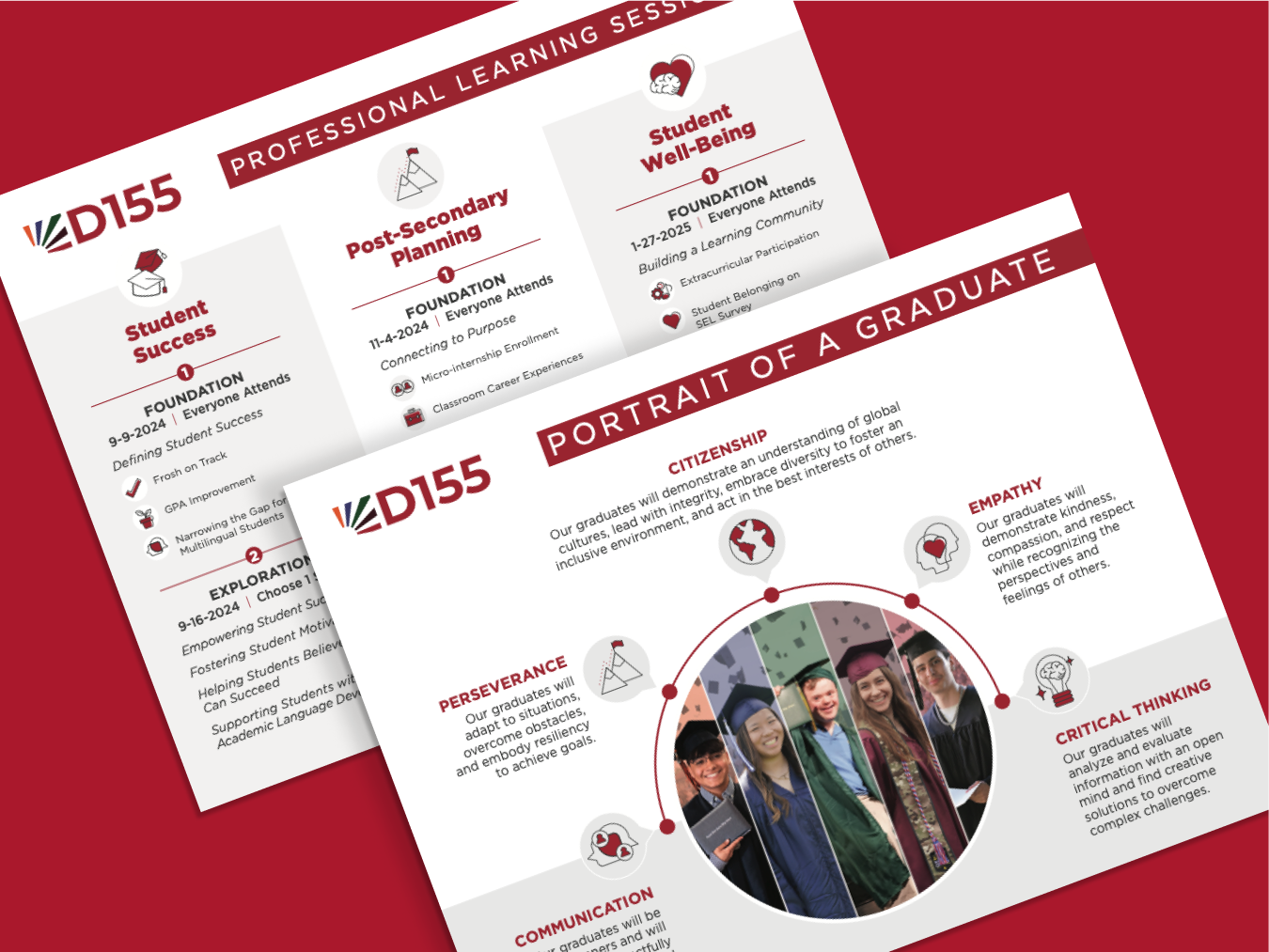
Modern, clean look
A new san serif font which conveys professionalism but with a friendly roundness.
Swapped salmon colors for neutral grays.
Balancing mostly white areas with pops of red and light gray divisions to help text-heavy documents breathe.
Keep red as a dominant color
Introduced a darker red that can be used for text or floods of color without being too harsh.
Incorporate new taglines
Created a version of the logo with taglines stacked underneath, also often use the taglines as design elements.
Incorporate all 5 high schools, visuals of promise and new horizons
Created a logo mark of a rising sun, with each high school represented as its own beam. These are organized in the order of establishment date, and together create a unified inspiring symbol.


“Caitlin has designed nationally recognized annual reports for our school district, and she makes the design process easy and enjoyable. Each year the annual report gets better and better!”
Shannon Podzimek, Director of Communications, Community High School District 155
Check out some other happy clients